How we visualized all of the Marvel movies in a beautiful – and interactive – way
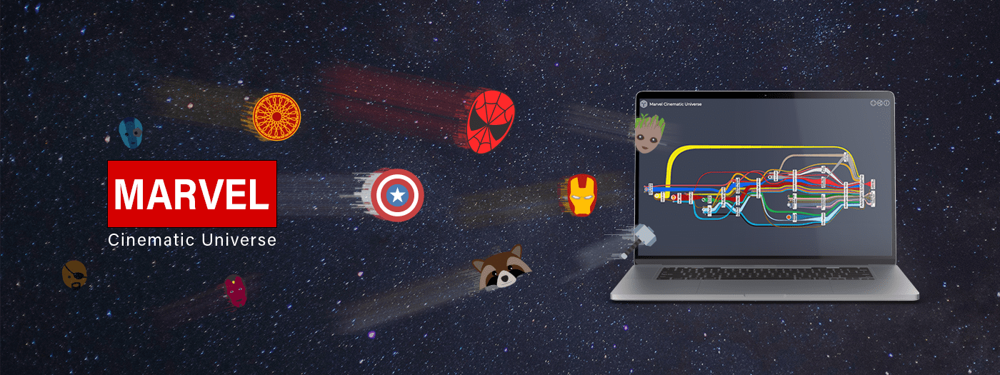
A swirling, colorful cosmos, the Marvel Cinematic Universe (MCU) is a popular series of interlocking films, each full of powerful characters. Inspired by a call put out by the Graph Drawing Conference, we set out to visualize these complex relationships on an interactive timeline. Read on to follow our quest…
Every year, the International Symposium on Graph Drawing and Network Visualization invites participants to visualize a specific set of relationships. Entries are evaluated based on aesthetic appeal, domain-specific requirements, and how well the data is visually represented.
In 2018, we diagrammed 84 characters from Game of Thrones – and won first place. For 2019, the data consisted of 28 characters from the Marvel Cinematic Universe and the movies in which they appear. We won again.
A graph is born
The data was provided in the GraphML format. Luckily, our diagramming SDK yFiles comes with GraphML support out of the box, so we could easily visualize the input data.
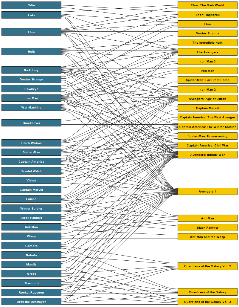
The provided graph consists of nodes that represent either a character or a movie in the Marvel Cinematic Universe (MCU). Edges in the graph each connect a character and a movie if the character appears in that movie. In graph theory terms, this is a so-called bipartite graph, where all edges connect only two different kinds of nodes.
Sadly, bipartite graphs are often not interesting to look at as their structure basically only suggests laying them out as what they are: Two separate clusters of nodes, with lots of edges crisscrossing between them. This chaos makes following the structure and meaning behind the graph a bit challenging for the viewer.
Journey through time
Early on, we decided to change the graph structure to reduce the amount of visual clutter. Turning the heroes into edges that connect their movies results in a visualization that’s easy to follow.
To determine the movie sequence in this structure, we augmented the original dataset with in-universe chronological information.
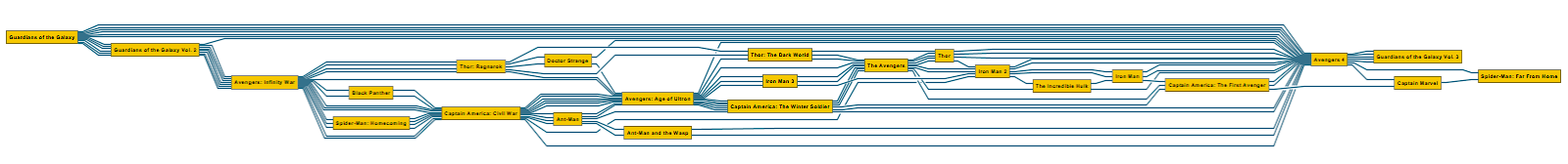
Above is the result of applying our hierarchic layout algorithm to this restructured graph. We based our final layout for this project on the very same layout algorithm, albeit with customizations along the way. Customization is a yFiles superpower.
Heroes wear capes
Until now, the graph still looked a bit bland. So we used yFiles’ styling capabilities to give each character their own icon and edge color. Movies got a more muted styling with a simple semi-transparent overlay over the characters’ journeys. Thus the edges appear as a continuous line or “cape”, seamlessly linking all movies for a given character.
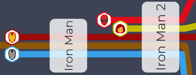
We then thought, well, this looks nice, but perhaps a bit too uniform. To make following the heroes a bit more interesting, we collected additional data – and visualized the characters’ screen time as edges with differing thickness. This resulted in a really dynamic visualization.
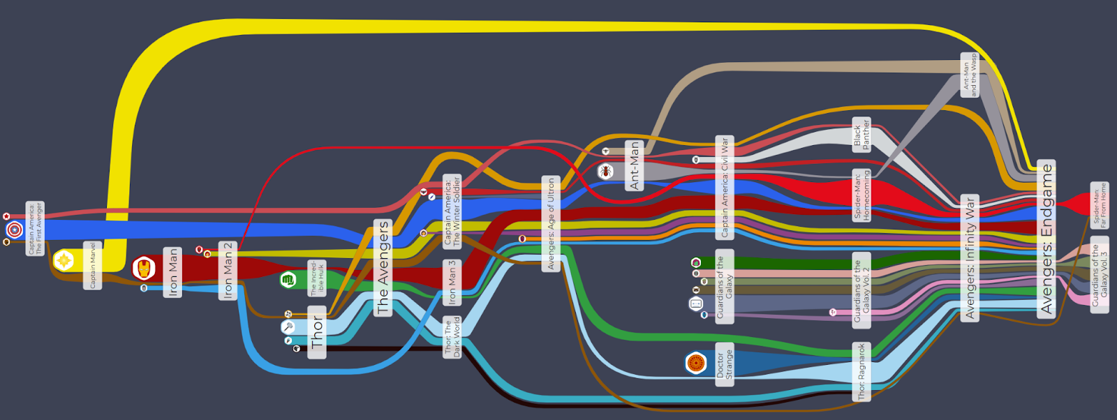
Despite having a chronological order, several movies appear to take place at the same time, as they are placed right above each other. To make the chronology clearer, we added a timeline in the background and customized the layout to place the movies in their respective time.
The final result, combining all of the elements mentioned above, looks like this:

With the data nicely laid out, and the diagram elements clearly visualized, we can grasp a lot of information at a glance. Important characters are easily recognized by their amount of screen time.
Test and experience yFiles free of charge!

- Free support
- Fully functional
- 100+ source-code examples
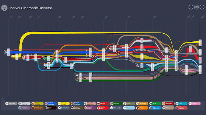
Lights, camera, interaction!
Since the graph was very detailed – and yFiles offers interactive exploration – we decided to turn it into an interactive app.
We added a legend to associate character icons with their name. Hovering over a character's edge, icon, or legend entry, lets you highlight that character, making it easier to follow their path through the movies.
Filtering is easy, as well. To get a more compact view of a hero or franchise, just click a hero (edge, icon, or legend entry) or a movie.
Sequels, prequels, and spin-offs
The contest data only included movies released through 2018. The nature of our visualization – especially since the layout is computed automatically – lets us update the data whenever a Marvel hero returns to the screen. To include Black Widow, for example, we only had to add the movie node and the character edges, the year, and the character screen times. So easy.
What do you think of our prizewinning graph? Message us on social media or get in touch here!
The features at a glance
- An interactive legend makes it easy to switch between superheroes.
- Incoming and outgoing edges are aligned and colored according to the character they represent.
- Customized character icons are always visible, regardless of the current viewport.
- Screen-time data determines the edge thickness.
- Interactive filtering and highlighting options let users focus on data subsets.
- A subtle black background shows the timeline and dates.
- The timeline can be expanded indefinitely.